That since has shifted dramatically. By 2050, a whopping 70% of people will live in urban areas – some of which will be megacities housing tens of millions of people. This trend of urbanization has been a boon to global growth and the economy. In fact, it is estimated today by McKinsey that the 600 top urban centers contribute a whopping 60% to the world’s total GDP.
Seven Types of Global Cities
With so many people moving to urban metropolitan areas, the complexion of cities and their economies change each day. The Brookings Institute has a new way of classifying these megacities, using various economic indicators. According to their analysis, here’s what differentiates the seven types of global cities: Important note: This isn’t intended to be a “ranking” of cities. However, on the infographic, cities are sorted by GDP per capita within each typology, and given a number based on where they stand in terms of this metric. This is just intended to show how wealthy the average citizen is per city, and is not a broader indicator relating to the success or overall ranking of a city.
- Global Giants These six cities are the world’s leading economic and financial centers. They are hubs for financial markets and are characterized by large populations and a high concentration of wealth and talent. Examples: New York City, Tokyo, London
- Asian Anchors The six Asian Anchor cities are not as wealthy as the Global Giants, however they leverage attributes such as infrastructure connectivity and talented workforces to attract the most Foreign Direct Investment (FDI) out of any other metro grouping. Examples: Hong Kong, Seoul, Singapore
- Emerging Gateways These 28 cities are large business and transportation hubs for major national and regional markets in Africa, Asia, Latin America, and the Middle East. While they have grown to reach middle-income status, they fall behind other global cities on many key competitiveness factors such as GDP and FDI. Examples: Mumbai, Cape Town, Mexico City, Hangzhou
- Factory China There are 22 second and third-tier Chinese cities reliant on export manufacturing to power economic growth and international engagement. Although Factory China displays a GDP growth rate that is well above average, it fails to reach average levels of innovation, talent, and connectivity. Examples: Shenyang, Changchun, Chengdu
- Knowledge Capitals These are 19 mid-sized cities in the U.S. and Europe that are considered centers of innovation, with elite research universities producing talented workforces. Examples: San Francisco, Boston, Zurich
- American Middleweights These 16 mid-sized U.S. metro areas are relatively wealthy and house strong universities, as well as other anchor institutions. Examples: Orlando, Sacramento, Phoenix
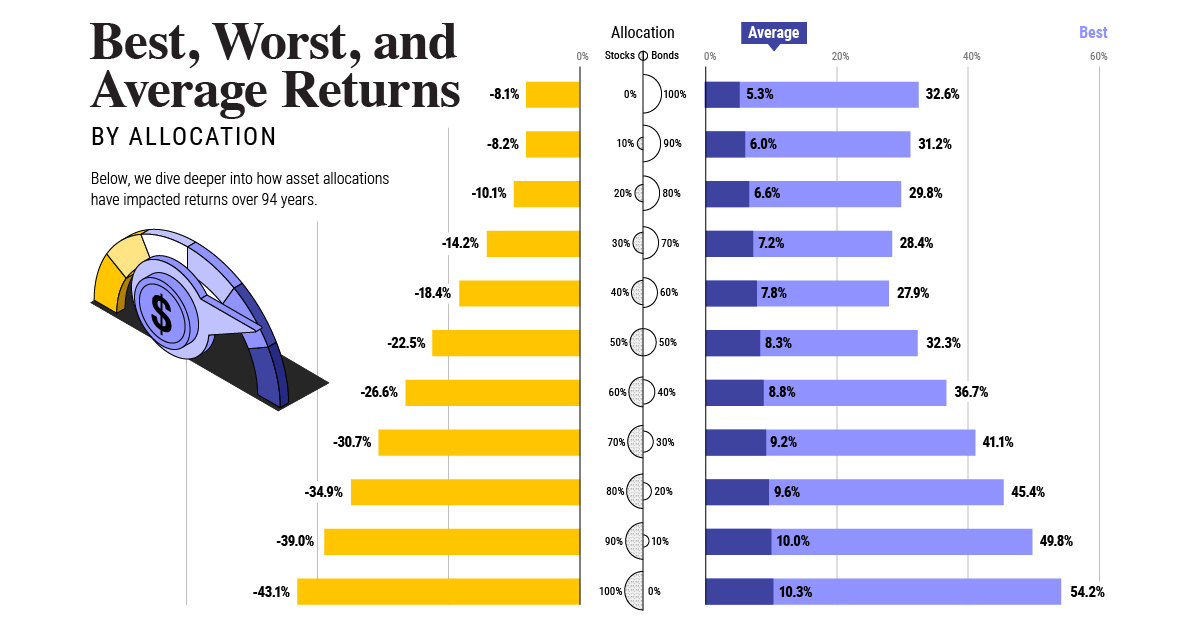
- International Middleweights These 26 cities span across several continents, internationally connected by human and investment capital flow. Like their American middleweight counterparts, growth has slowed for these cities since the 2008 recession. Examples: Vancouver, Melbourne, Brussels, Tel Aviv on Last year, stock and bond returns tumbled after the Federal Reserve hiked interest rates at the fastest speed in 40 years. It was the first time in decades that both asset classes posted negative annual investment returns in tandem. Over four decades, this has happened 2.4% of the time across any 12-month rolling period. To look at how various stock and bond asset allocations have performed over history—and their broader correlations—the above graphic charts their best, worst, and average returns, using data from Vanguard.
How Has Asset Allocation Impacted Returns?
Based on data between 1926 and 2019, the table below looks at the spectrum of market returns of different asset allocations:
We can see that a portfolio made entirely of stocks returned 10.3% on average, the highest across all asset allocations. Of course, this came with wider return variance, hitting an annual low of -43% and a high of 54%.
A traditional 60/40 portfolio—which has lost its luster in recent years as low interest rates have led to lower bond returns—saw an average historical return of 8.8%. As interest rates have climbed in recent years, this may widen its appeal once again as bond returns may rise.
Meanwhile, a 100% bond portfolio averaged 5.3% in annual returns over the period. Bonds typically serve as a hedge against portfolio losses thanks to their typically negative historical correlation to stocks.
A Closer Look at Historical Correlations
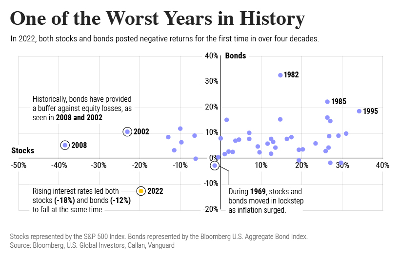
To understand how 2022 was an outlier in terms of asset correlations we can look at the graphic below:
The last time stocks and bonds moved together in a negative direction was in 1969. At the time, inflation was accelerating and the Fed was hiking interest rates to cool rising costs. In fact, historically, when inflation surges, stocks and bonds have often moved in similar directions. Underscoring this divergence is real interest rate volatility. When real interest rates are a driving force in the market, as we have seen in the last year, it hurts both stock and bond returns. This is because higher interest rates can reduce the future cash flows of these investments. Adding another layer is the level of risk appetite among investors. When the economic outlook is uncertain and interest rate volatility is high, investors are more likely to take risk off their portfolios and demand higher returns for taking on higher risk. This can push down equity and bond prices. On the other hand, if the economic outlook is positive, investors may be willing to take on more risk, in turn potentially boosting equity prices.
Current Investment Returns in Context
Today, financial markets are seeing sharp swings as the ripple effects of higher interest rates are sinking in. For investors, historical data provides insight on long-term asset allocation trends. Over the last century, cycles of high interest rates have come and gone. Both equity and bond investment returns have been resilient for investors who stay the course.
